
























What mistakes to avoid when displaying jewelry?
Why avoid common jewelry display mistakes
Displaying jewelry seems simple: you place it, light it, and wait for people to like it. The reality is quite different. The presentation of a piece of jewelry directly influences the perception of its value, its quality, and therefore the purchasing decision.
A study often cited in the industry indicates that the same piece, presented in two different contexts, can see its perceived value vary from one to three times. In other words, your presentation is worth as much as your work.
In this guide, we review the ten most common mistakes made when displaying jewelry—in-store, on a stand, in a shop window, or even in photos—and we give you precise solutions to transform each piece into a visual highlight.


1. Mixing all jewelry families
The most visible mistake among beginner exhibitors: displaying rings, necklaces, bracelets, and earrings all jumbled together in the same area. The result is immediately chaotic. The customer does not know where to look, their brain looks for logic and, finding none, gives up.
The solution is simple: create islands by family. A necklace area, a ring area, a bracelet area, an earring area. This segmentation helps the customer visualize, compare, and choose.
It also makes cross-selling easier: "Have you seen the matching earrings?" becomes a natural question, provided the earrings are within a meter and not lost among the rest.
2. Choosing a display that contradicts the piece
The display is a silent but central player. If poorly chosen, it undermines the piece. A fine jewelry ring on a cheap acrylic cube looks inexpensive; a bohemian long necklace on a minimalist white bust loses its soul.
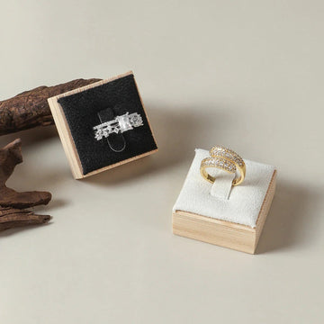
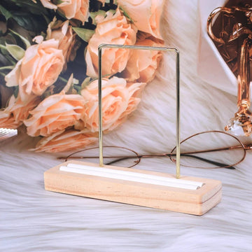
The golden rule: the material of the display should extend the jewelry's world. Velvet and faux suede for precious and contemporary items; light wood, linen, and stone for artisanal and natural ones; matte black or copper metal for mineral and industrial pieces; thick, transparent acrylic for minimalist and modern items.
If your collections cover several worlds, plan for several ranges of displays and do not mix them in the same display.
| Display material | Jewelry world |
|---|---|
| Velvet and faux suede | Precious and contemporary |
| Light wood, linen, and stone | Artisanal and natural |
| Matte black or copper metal | Mineral and industrial |
| Thick, transparent acrylic | Minimalist and modern |

3. Poorly planned lighting
Without light, there is no jewelry. Light is what reveals the sparkle, the depth of the stones, the texture of the metals. Yet, many displays rely on ambient lighting, which is almost always unsuitable: too yellow, too diffused, too centered on the ceiling.
The three lighting rules to remember
First, the color temperature should be neutral (4000 to 4500 K). Second, the angle should be grazing or semi-grazing (30 to 45° from the vertical), never directly overhead. Third, the intensity should be adjustable: a piece that is too brightly lit looks flat; an under-lit piece disappears.
The ideal is to create a slight contrast between the illuminated piece and its environment.
Find the ideal display for each piece
Discover our complete catalog of jewelry displays in velvet, wood, metal, and acrylic to dress each of your collections.
View the collection4. Lack of visual hierarchy
A display without hierarchy is a display that tells no story. Not all jewelry is equal in a display: there is the signature piece, the favorites, the entry-level references. If everything is presented at the same height, with the same density, with the same lighting, you lose the focal point effect.
Consciously choose one to three featured pieces per display. Give them more space around them, a higher position, ideally slightly more pronounced lighting. The other jewelry orbits around them, in harmony. This hierarchy helps the customer enter your world step by step, and significantly increases sales of the flagship pieces.

5. Neglecting the background and dominant color
The background is the invisible set that holds the entire composition together. A poorly chosen background destroys the impact of even a magnificent piece of jewelry. Pure white backgrounds are risky: they reflect a cold light that flattens the pieces. Very shiny black backgrounds create unwanted reflections. The ideal for most jewelry?
Matte shades, deep but not dull: slate gray, burgundy, forest green, sand beige, midnight blue.
The contrast rule: choose a background that contrasts with the majority of your pieces without creating a chromatic conflict. Gold stands out on a deep and warm background; silver stands out on a bluish or neutral background; colored stones stand out on a neutral background that does not "speak".
| Jewelry | Background that highlights it |
|---|---|
| Gold | Deep and warm background |
| Silver | Bluish or neutral background |
| Colored stones | Neutral background that does not "speak" |
6. Overcrowding the display space

The more you display, the less you sell. This is the paradox of display: the customer cannot desire what they cannot distinguish. An overloaded shop window or stand triggers "choice fatigue" that pushes them to flee rather than buy.
The rule of active empty space
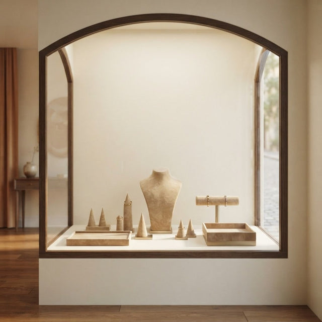
Reserve 40 to 60% of your surface for empty space. This empty space is not an absence: it is breathing room, visual silence that amplifies what is displayed. Luxury brands have understood this for a long time: the fewer pieces there are in a shop window, the more precious each one seems.
You can test the effect immediately by removing half of the pieces from your current display.
7. Displaying flat what should have volume

A necklace laid flat looks like a pile of chain. A bracelet laid flat loses all its personality. A jewelry set laid flat becomes a puzzle. Yet, this is still mistake #1 in many product photos and even some local shop windows.
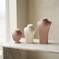
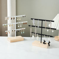
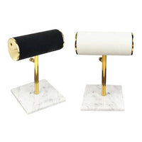
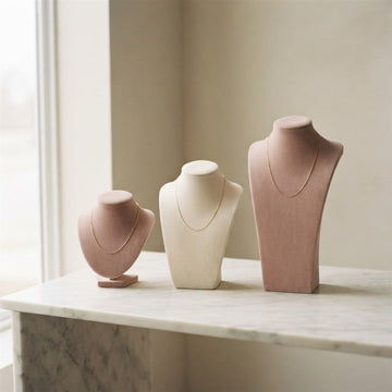
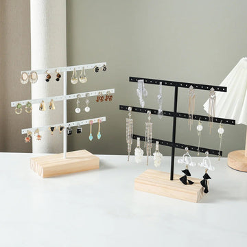
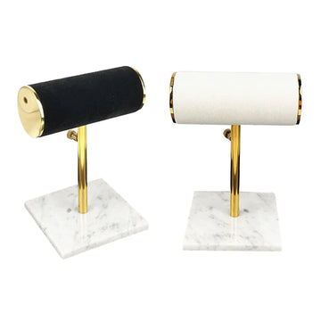
Any jewelry designed to be worn should be displayed in volume. Necklace supports give the natural drape; cylindrical bracelet holders restore the shape of the wrist; vertical earring holders show the movement. This display in volume radically changes the perceived value, because it helps the customer immediately project themselves with the piece.
8. Forgetting the customer behind the display

A display that is beautiful to look at but inconvenient to explore does not sell. If the customer does not dare to touch, cannot grab the piece without risking dropping everything, or cannot find the mirror, you lose the sale. The functionality of a display is as important as its aesthetics.
The details that reassure and invite touching
Provide a mirror at face height, accessible. Place the most expensive or delicate pieces in slightly higher displays but always within reach. Avoid precarious stacking. Allow the customer to grab, try on, compare. Nothing is more powerful than a tried-on piece of jewelry: it is the most reliable purchase trigger.

9. Underestimating maintenance and cleanliness

A dusty display, a pilling velvet, a fingerprint on the acrylic, and all your work collapses. The perception of a quality piece of jewelry passes through an impeccable environment. This seems obvious, but wear is gradual: you no longer see it by constantly being around it.
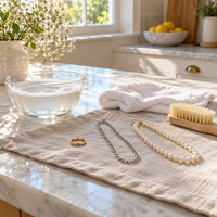
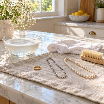
Adopt a routine: cleaning every morning before opening, checking the displays at midday, polishing the displayed pieces at least once a week. Always keep a microfiber cloth, a special acrylic wipe, and a mini brush for the velvet within reach. It is an investment of five minutes a day that is worth hundreds of euros in annual sales.
10. Never updating the display
A frozen shop window or display is a display that dies slowly. Regular customers walk past and no longer stop, because they feel they have already seen everything. Updating the display—even if only every two weeks—constantly restarts interest.
You do not need to renew all your stock: it is enough to change the layout, change the dominant colors, introduce a theme (season, holiday, brand anniversary, launch). This breathing also proves that your brand is alive, which is reassuring for a loyal customer.
Refresh your display world
Velvet trays, faux suede busts, metal or wood supports: compose several seasonal displays with our complete collection of displays.
View the display traysSummary table: the 10 mistakes and their antidotes
| Mistake | Antidote |
|---|---|
| Mixed families | Islands by jewelry type |
| Contradictory display | Material consistency between jewelry and support |
| Poorly planned lighting | 4000K grazing adjustable LED |
| No hierarchy | 1 to 3 featured pieces per scene |
| Neglected background | Contrasting matte shades |
| Saturation | 40 to 60% active empty space |
| Flat display | Systematic overstocking |
| Customer oversight | Mirrors, access, ergonomics |
| Lack of maintenance | 5-minute daily routine |
| Static display | Bi-monthly refresh |
How to display jewelry by piece family
The errors above are corrected more quickly when you know the right technique for each type of jewelry. Each family has its own display logic, and the customer recognizes it instinctively.
How to display rings without them falling over?
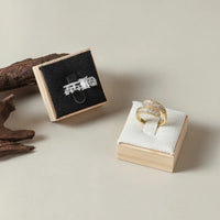
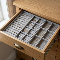
A cone or ramp keeps the ring upright and visible from the front. A velvet slotted tray holds several in a small space, provided you only fill part of it: a full tray looks like stock.
Alternate two cone heights to break the alignment, and place the most elaborate rings on the highest support.
How to display bracelets to maintain their shape?
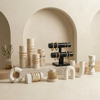
A cylindrical bar or round cushion restores the shape of the wrist. Lying flat, a bracelet loses its volume and blends into the background. Display three or four per support, never more, so that each link can be seen.
Where to display your jewelry: window, counter, or wall?
Each location has its role, and mixing them is like saying everything at once.
- Window: catch the eye from the street with one to three featured pieces and plenty of empty space.
- Counter: compare and try on, with trays, busts, and a mirror within easy reach.
- Wall: show the full range, with panels or frames at eye level.

Audit your display in five minutes
Before buying anything, look at your window or stand as a customer would. A quick audit almost always reveals two or three errors from the list.
The five questions to ask yourself in front of your window
- Can you tell at a glance which piece is the star?
- Does each jewelry family have its own island?
- Does the display match the jewelry world?
- Is 40 to 60% of the space empty?
- Is everything clean, straight, and within reach?
The three-second test
Take three steps back, look for three seconds, then close your eyes. If you cannot describe the featured piece, the customer won't see it either. Start over after each change.
| If the answer is no | What to do |
|---|---|
| No featured piece | Isolate a piece, elevate it, light it a little more |
| Mixed families | Group by islands |
| Inconsistent display | Change the material or range |
| Too many pieces | Remove half of the presentation |
| Dust or marks | Resume the five-minute daily routine |
Correct without changing everything: where to start
There is no need to buy everything at once. The most effective corrections are also the simplest, and they are done in order.

The gestures that cost nothing
Remove half the pieces, group by family, raise the featured pieces to eye level, and clean everything. These four gestures alone solve most saturation, hierarchy, and cleanliness errors.
When to renew your supports
The support becomes a priority when it contradicts the piece, when the velvet pills, or when it lacks the volume to display a necklace or bracelet.
First replace the supports in the most visible area, then the rest of the range, keeping a maximum of two or three consistent material families.
Our selection for refreshing the display
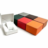
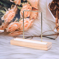
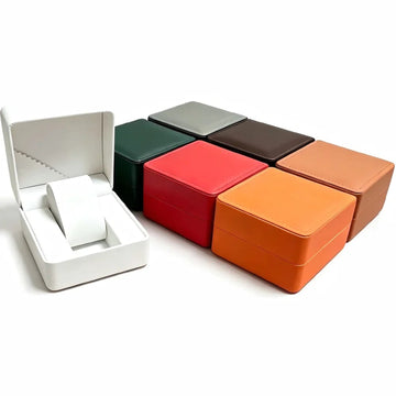
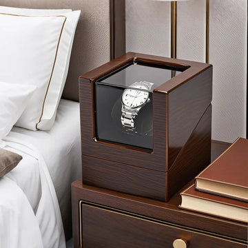
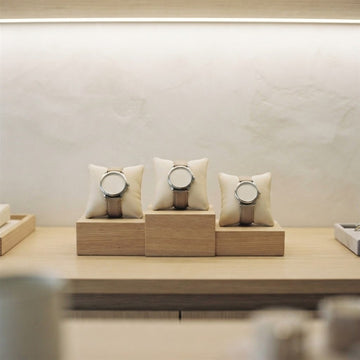
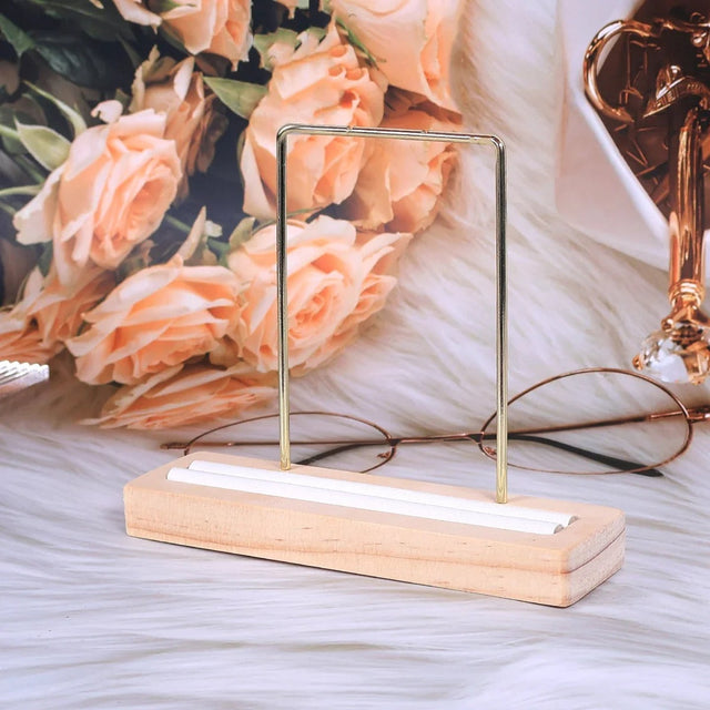
Four supports from neighboring families, to be combined by color and material.


Conclusion: displaying is selling twice
Each display error costs you more than you think: not only the direct sale not concluded, but also the brand image, memorization, word of mouth. Conversely, a thoughtful display transforms each piece into a silent sales argument.
Investing in suitable displays, taking care of the lighting, structuring the visual hierarchy, and maintaining the whole is a virtuous cycle: your work shines, your brand grows, your customers return. Audit your display regularly with a fresh eye — that of a customer discovering your universe for the first time — and continuously correct these ten errors.
The results are measurable in a few weeks.
Give your jewelry the display it deserves
Busts, trays, earring holders, boxes: explore our complete presentation universe designed for demanding creators and jewelers.
See the necklace bustsFAQ — Displaying your jewelry well
What is the most versatile display to start with?
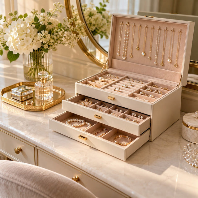
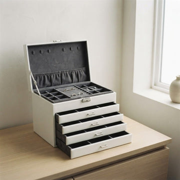
The velvet or faux suede tray remains the most versatile. It holds rings, earrings, pendants, and small bracelets. Combine it with a necklace bust and a cylindrical bracelet holder to cover 80% of the needs.
How to avoid annoying reflections in the store?
Favor displays with a matte or semi-matte finish, and place your light sources at an angle rather than in front of the window. For glass windows, LED lights grazing the ceiling avoid most reflections.
What is the ideal height to display jewelry at eye level?
The average eye level is between 1.55 m and 1.70 m. Your flagship pieces should be in this range. In the window, create levels at 1.30 m, 1.50 m, and 1.70 m to offer three reading planes.
Should prices be displayed on all jewelry?
Yes, in 95% of cases. The absence of prices hinders impulsive purchases and scares away shy customers. Use small, discreet but readable labels, in a typography consistent with your brand.
How to display jewelry in photos for social media?
Rely on natural daylight, neutral backgrounds (linen, light wood, marble), displays consistent with your universe, and a 4:5 high-angle shot. Visual consistency counts as much as the beauty of each photo.
Can I mix several display materials?
Yes, provided you master a maximum of two or three consistent families. Light wood + linen + matte black metal works very well. Black velvet + acrylic + gray faux suede also. Beyond three families, you lose readability.
How many times a year to renew a display?
Ideally, a rotation every two to four weeks for windows visible from the street, and a deeper change at each season or major commercial event (holidays, Mother's Day, weddings, back-to-school).
Get our next articles
Tips, guides and new arrivals, straight to your inbox.