
























How to showcase your jewelry in an Instagram photo?
Showcasing jewelry in Instagram photos requires the same rigor as a shop window: one piece, one display, one light source, one composition. This article covers the complete method, from choosing displays to final editing, with answers to the questions you might have before publishing.
Why Instagram has become the #1 shop window for jewelry
On Instagram, your jewelry has less than two seconds to convince. Two seconds to stop the scroll, make someone want to click, trigger a save or a comment, or better yet, a visit to your store.
The big difference between accounts that sell and those that stagnate is neither the number of followers nor the advertising budget: it is the presentation. Showcasing jewelry well on Instagram means learning to compose an image that exudes the brand, confidence, and desire.
It also means placing the right displays in the right place, choosing the right lighting, format, and style. Whether you are an independent creator, jeweler, artisan, or retailer, this article gives you the complete method to transform your feed into a true commercial shop window, with premium, cohesive images designed to convert.

Think of Instagram as a shop window, not an album


The big mistake beginner jewelry makers make is posting whatever they have on hand: a quick snapshot, a selfie in the store, a piece of jewelry set down on the kitchen table. Instagram isn't a personal photo album; it's your brand's storefront, open 24/7 to the whole world.
The same rigor you apply to a shop window must apply here: choice of materials, hierarchy of pieces, lighting, color consistency.
Concretely, every image you publish must answer three questions: which piece do I want to highlight? what emotion do I want to evoke? what action do I want to trigger? If you cannot answer them, the post is not ready.
Define your jewelry visual identity
Even before talking about displays, lay the foundations of your universe. A solid visual identity rests on four pillars.
- A color palette of 3 to 5 shades maximum (for example: cream, beige, terracotta, gold, off-white). This palette guides the backgrounds, accessories, and even the editing.
- A material universe: linen, velvet, marble, raw wood, stone, patinated metal. Choosing 2 or 3 dominant materials is enough to make an account instantly recognizable.
- A photographic style: clean product shot, warm lifestyle, dark editorial, natural and bright. Choose one and stick to it.
- A brand tone: romantic, minimalist, urban, bohemian, classic fine jewelry. The tone shows through the visuals as much as in the captions.
This foundation is what transforms a nice feed into a truly memorable brand. And it is what guides all your choices of displays and setups.
The displays that make a difference on Instagram
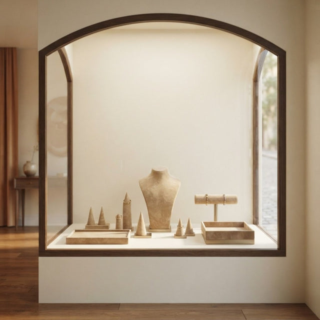
On Instagram more than anywhere else, jewelry displays are your best allies. They add volume to the image, depth to the piece, and an immediate signal of professionalism. Here are the essentials.

The necklace bust
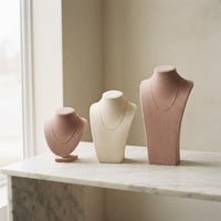
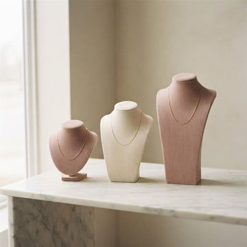
A necklace bust in cream velvet, sand faux suede, or ecru linen transforms a simple chain into a shop piece. It is the ultimate Instagram display: it elongates the pendant, gives an elegant silhouette, and works just as well in a post as in a Reel. Vary the heights (mini bust, half bust, long bust) to create depth in your compositions.
The ring holder
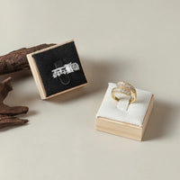
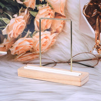
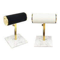
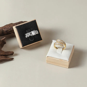
A sculptural ring holder — minimalist hand, wooden cylinder, marble holder — gives a recognizable signature. For the close-up, a mini velvet cushion is enough; for Reels, a vertical holder allows you to showcase several stackable pieces.
The presentation tray
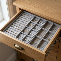
A jewelry tray in velvet, linen, or patinated wood is used to compose flat lays, collection overviews, and new arrivals. It is the king format of carousels.
The box or jewelry case
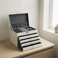
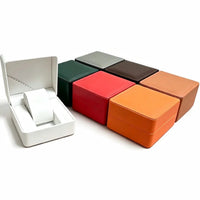
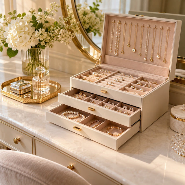
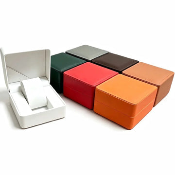
A jewelry box in velvet or linen, slightly open at an angle, instantly tells the story of the gift, the capsule collection, the exceptional piece. Very effective in end-of-year stories and packaging Reels.
Thematic holders
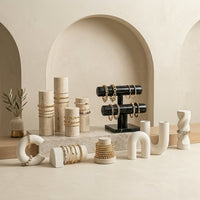
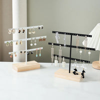
For an account with a strong identity (bohemian, nautical, urban), holders in ceramic, raw stone, driftwood, or matte black metal allow you to tell a complete universe without any caption. Consistency comes from the materials.
Compose the ideal display kit for your feed
Select your busts, trays, and holders in cohesive shades: this is the foundation of an immediately recognizable Instagram feed.
View our jewelry displays5 essential setups
1. The collection flat lay
A perfect overhead view, a velvet or linen tray, several pieces arranged with balanced spacing between them. Ideal for announcing a new release, telling a seasonal story, or presenting a mini capsule collection. The rule: one central focal point and 3 to 5 secondary pieces.

2. The silhouette portrait
A necklace bust on a plain background, soft side lighting, the necklace in full light. Shot in 4:5 format, it instantly gives you the stature of a premium boutique. Vary the angles: straight on for the packshot, slightly off-center for storytelling.
3. The worn piece
A wrist, fingers, an ear: showing jewelry on real skin creates a powerful emotional connection. Favor natural window light, neutral backgrounds (a white wall, a beige T-shirt, a linen dress), and close-ups without faces to keep the focus on the jewelry.
4. The macro close-up
An extreme close-up of the stone, the engraving, the setting. It makes people want to click to see more and builds perceived value. This shot also works great as a Reels cover photo.
5. The lifestyle setting
Morning coffee, an open book, eucalyptus branches, shoes, perfume, home accessories. This "premium real life" style tells the jewelry's story within a desirable everyday life. Ideal for gaining authenticity and shares.
Posts, Reels, Stories: adapting your styling to each format
The post (1:1 or 4:5)
It is your permanent shop window. Favor quality over quantity: 3 to 4 well-crafted posts per week are better than 7 mediocre ones. Carousels (up to 10 visuals) are today the best performing formats in jewelry e-commerce: think product shot + macro + worn + atmosphere + detail.
The Reel (9:16)
Vertical format, 7 to 30 seconds, short movement. Highlight the shine, the movement of the chain, the light sliding over a stone. Three shots are enough: placing the jewelry on the display, close-up of the piece, worn view. A set soundtrack and a short text (1 to 2 lines) maximize saved views.
The Story (9:16)
The right format for behind the scenes, "behind the scenes", polls, new arrivals previews. Use stickers to engage (poll, quiz, product link). One story per day with a well-chosen display is enough to maintain the commercial link.
Lighting, background, colors: the winning trio
Natural light remains the best for Instagram. It gives a warm and reassuring result, perfectly suited for jewelry photography. Photograph 1 or 2 meters from a large window, avoiding direct sunlight. For consistency, complement with a diffused 5500 K LED panel.

For the background, stay true to your palette. Three families work particularly well:
- Cream and beige tones: warm, timeless, perfect for gold and warm stones.
- Pearl gray and taupe: sophisticated, ideal for silver, steel, light stones.
- Deep velvets (burgundy, forest green, midnight blue): luxurious, perfect for fine jewelry pieces.
Avoid saturated backgrounds (bright red, neon yellow) that distract the eye from the piece. On Instagram, sobriety is a commercial weapon.
Showcasing jewelry in Instagram photos: composition, sharpness, and editing
A beautiful setup is not enough: the photo must also be sharp, well composed, and true to the real colors. Three simple settings make the difference, without studio equipment.
Composition: place the jewelry on a third
Imagine the photo divided into nine boxes by two vertical lines and two horizontal lines. Place the piece on one of the intersections rather than exactly in the center: the eye finds the jewelry immediately and the image appears more alive.
Leave a little air around the display. On a smartphone, it is better to have a well visible jewelry in a clean frame than a tiny piece lost in the decor.
Sharpness: avoid motion blur
Blur almost always comes from a phone held in hand in too weak light. Rest your elbow on the table or place the device on a small tripod, then touch the screen to focus on the stone or the main pattern.
Clean the lens before each session: a fingerprint veils the whole photo and makes the metal lose its shine.
Editing: correct without distorting
Adjust the brightness and contrast, straighten the horizon, then compare the edited photo with the jewelry placed next to your screen. The metal must keep its true shade, the stone its true color.
Keep the same settings from one photo to another: this regularity builds the identity of the feed as much as the color palette.

Build a cohesive feed over time
Consistency is played in the grid of the last 9 publications. Before posting, check the board: alternate product shot, lifestyle, portrait, close-up. Avoid two visuals of the same type side by side. Use a planning tool (Meta Suite, Later, Planoly) to visualize the result.

A good rule of thumb for distribution:
| Visual type | Recommended share | Objective |
|---|---|---|
| Premium packshot | 30% | Show the product clearly |
| Lifestyle / staging | 25% | Create desire, tell a story |
| On-model shot | 20% | Help customers imagine wearing it |
| Macro close-up | 15% | Justify the price |
| Behind the scenes / workshop | 10% | Build trust |
Give your feed a distinctive visual signature
Busts, trays, ring displays, jewelry boxes: choose a cohesive family and make it the DNA of your Instagram account.
Choose my displaysCaptions, hashtags and link in bio: turn a photo into a visit
A photo catches the eye, but the text and link bring the visitor to the store. Three elements are enough to guide the reader from the image to the product page.

A short caption that creates desire
Start with a sentence that names the piece and the emotion it evokes. Add the material, a finishing detail and a clear call to action: save the post, leave a comment or click the link in bio.
A few targeted hashtags
A few precise hashtags related to the piece, the material and your brand universe are better than a long generic list. They help people looking for exactly this type of jewelry find you.
The link in bio and stickers
The link in bio leads to the store, and the link sticker in a story leads to the product page of the piece shown. Check that the landing page matches the photo: the visitor must recognize the jewelry in one second.
| Element | Role | Key point |
|---|---|---|
| Caption | Tell the story of the piece | A hook, then a detail |
| Hashtags | Get found | A few, precise and related to the piece |
| Link in bio | Lead to the store | A single clear destination |
| Link sticker | Open the product page | Related to the piece visible in the story |
| Call to action | Trigger the action | One per post |
Measure what works and adjust your staging
An account grows by observing its own results. The professional account provides statistics that simply need to be read systematically, once a week or once a month.
The statistics that matter
First, look at saves and shares: they show that an image makes people want to come back. Profile visits and clicks to the link in bio then tell you if the photo brings visitors to the store.
Change only one variable at a time
To find out what works, change only one element per series of posts: the background, the angle or the display. If you change everything at the same time, you won't know what made the difference.
The pace of a month of posts
Over a month, alternate the formats and types of visuals from the distribution table. Note down the three most saved posts in a simple notebook, then recreate a variation of them the following month.
Our favorite displays for your Instagram photos
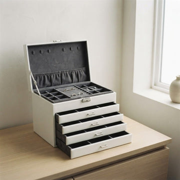
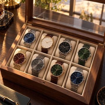
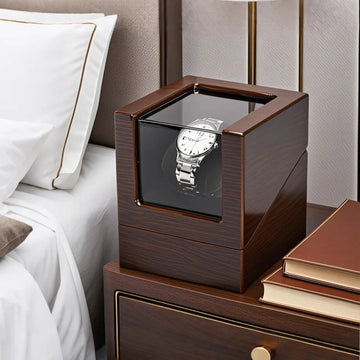
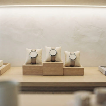
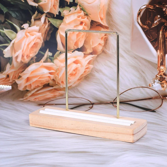
Four displays showcase the families that work well in photos: the velvet bust, the ring holder, the compartment tray and the marbled leather jewelry box. Each pairs well with a neutral palette.


To browse the full range, visit the velvet jewelry display and suedette jewelry display collections.
The mistakes that hurt engagement
- Blurry or poorly framed photos: 1 blurry image = -50% perceived reach.
- Inconsistent backgrounds: every post has a different look. The grid loses its identity.
- Jewelry too small in the frame: on a smartphone, you must be able to see the piece without zooming.
- Too many filters: the colors of the metals and stones are distorted, trust decreases.
- No display: the piece looks hastily placed. A bust, tray or cushion solves the problem immediately.
- No call to action: a beautiful visual without a call to action is a lost sale. Always redirect to the store in bio or via a sticker.

To go further: How to photograph jewelry properly? and How to match displays to your brand identity?.
FAQ – Displaying jewelry on Instagram
What is the best time to post jewelry on Instagram?
In France, the 12h-14h and 19h-21h slots work particularly well for jewelry. Test for a month and adjust with your professional account statistics.
Which format to choose: square, vertical or Reel?
The 4:5 vertical format takes up more screen and performs better than square. Reels generate more reach. The winning rule: 50% carousels in 4:5, 40% Reels, 10% single posts.
Should you film or photograph your jewelry?
Both are complementary: the photo builds the grid and the brand, the video boosts reach and engagement. Invest in displays: they work for both.
How many displays do you need to get started on Instagram?
A necklace bust, a velvet or linen tray, a ring holder and a mini earring holder make up the minimum kit sufficient for 90% of posts.
How to make a jewelry Instagram feed cohesive?
Choose 3 dominant colors, a maximum of 2 display materials, similar lighting for all photos, and alternate the types of shots in the grid (packshot, lifestyle, portrait, macro).
Should you publish the price in the caption?
Yes, except for very high-end positioning. Indicating the price reduces friction, qualifies the audience and increases conversion. Also mention availability and a direct link to the product page.
How to show jewelry in motion without blur?
Film in plenty of natural light, mount the camera on a tripod or stabilizer, slow the motion down to 0.5x or 0.25x, and add light stabilization when editing.
What background to choose for photographing jewelry for Instagram?
A solid and matte background from your palette: cream, beige, pearl gray or deep velvet. Avoid saturated backgrounds that distract the eye from the piece.
Do you need a tripod to photograph or film your jewelry?
It is not mandatory, but a small tripod or a stable support prevents camera shake and keeps the same framing from one photo to the next, which strengthens the cohesion of the feed.
How to avoid reflections on metal and stones?
Work with soft and diffused light, near a window without direct sunlight, and slightly tilt the display until the reflection disappears. A diffused LED panel helps maintain consistent lighting.
Get our next articles
Tips, guides and new arrivals, straight to your inbox.