
























Which display should I choose for gold jewelry?
• Gold rings
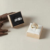
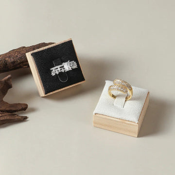
Use slanted ramps or square velvet cushions to reveal the center stone and the metal's reflections. Yellow gold stands out on a gray background, white gold on a matte black background. Discover our complete collection of ring displays.
• Gold necklaces
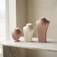
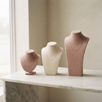
The cream or beige faux leather bust remains a safe bet. It fits the neck and highlights the texture of the link. For delicate pieces, opt for a light bust and warm lighting between 3000–3500K. Discover our necklace and chain displays.
• Gold bracelets
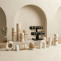
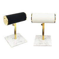
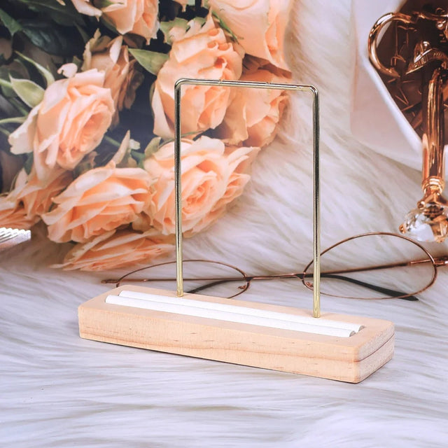
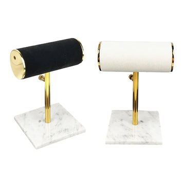
Cylindrical displays or double bars are perfect. Choose a soft surface that does not catch the chain. A sand or caramel tone will enhance yellow gold.
• Gold earrings
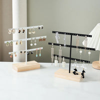
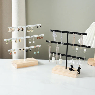
Display them on microfiber plates or velvet frames. Avoid shiny metal grids that interfere with the light. A matte background will make the polished metal stand out. Browse our collection of earring displays.
• Watches and sets
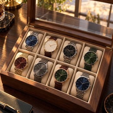
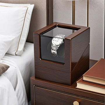
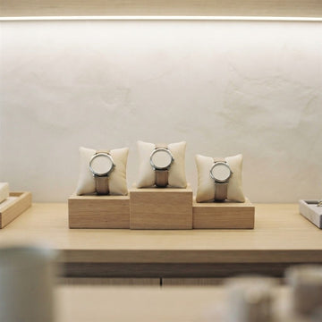
For gold watches or full sets, prefer a beige faux leather watch display. This highlights the uniformity of the metal without stealing the light.
5) The ideal lighting to enhance gold jewelry
Gold is a warm metal: it reveals itself under lighting that mimics that of the sun. Use bulbs with a warm temperature (3000–3500K) with a CRI above 90 to reproduce natural tones.
- Avoid very cool white neons (above 5000K).
- Prefer spots oriented at 30–45° to create soft reflections.
- Combine direct lighting on the jewelry and indirect lighting on the display background.
💡 Bonus tip: a slight golden LED halo at the base of the necklace bust creates a luxurious aura that attracts the eye without blinding.

6) Adapting the display to the style of your store
- Modern store → beige faux leather, transparent acrylic, brushed gold bases.
- Artisanal workshop → light wood, natural linen, warm colors (sand, chestnut).
- High-end jewelry → anthracite velvet, champagne microfiber, glass domes.
- E-commerce → matte neutral displays (gray, cream) for product photos without reflections.
The secret is to maintain a visual consistency between your supports and your brand image. Customers instinctively associate the quality of the display with that of the jewelry on display.

7) The mistakes to avoid with gold jewelry
- ❌ Glossy white displays: they dull the warm tone of the metal.
- ❌ Multiplying textures (wood + velvet + metal): cluttered effect.
- ❌ Cool or bluish light: makes yellow gold look “green”.
- ❌ Too many pieces of jewelry side by side: loss of focus on each piece.
- ❌ Mixing yellow gold and white gold on the same display: visual confusion.
8) Perfect color / material combinations for gold jewelry
| Gold type | Ideal background color | Recommended material | Visual effect achieved |
|---|---|---|---|
| Yellow gold | Light beige, taupe, or linen | Faux leather or light wood | Warmth and natural richness |
| White gold | Dark gray, matte black | Velvet or microfiber | Cool shine and high-end contrast |
| Rose gold | Cream, sage green, sand | Matte microfiber | Softness and romance |

9) Checklist before choosing your gold jewelry display
- ✔ The display contrasts well with the shade of gold (neither too warm nor too cool)
- ✔ The material does not reflect light (prefer matte to glossy)
- ✔ The supports are stable and suitable for the weight of the jewelry
- ✔ The overall look respects your visual identity (brand consistency)
- ✔ The lighting is even across the entire display case
🛍️ Discover our necklace displays, our ring displays and our bracelet displays specially designed for gold jewelry.

10) How to arrange a gold jewelry display in a display case or on a stand?
A good display is not enough: the way you arrange it matters just as much. Gold is best seen when each piece has space, a consistent background, and accompanying light.

Let each piece breathe
Gold jewelry needs space around it. When pieces touch, the eye no longer knows where to rest and the perceived value decreases. One statement piece per support is better than an overloaded support.
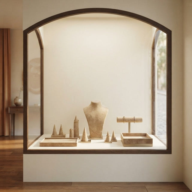
Alternate heights with busts, ramps, and cylinders, but keep a single color family so that the overall look remains readable at first glance.
Group by gold shade
Do not mix yellow gold and white gold on the same support: visual confusion blurs the message. Group pieces by shade, then by family (rings, necklaces, bracelets), and give each group the background that suits it.
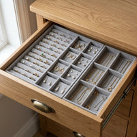
This logic also works at home: one tray per shade makes it easier to store and choose the jewelry of the day, without rummaging through a drawer.
Finally, remember to refresh the presentation from time to time: changing the order of the pieces or the height of a bust revives interest in a display case and a stand without any additional purchase.
11) How to care for your gold jewelry and its display?
A clean display highlights the gold, while dust and fingerprints dull the shine. A few regular steps are enough to keep a display case impeccable.
Clean the fabric and surfaces
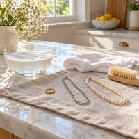
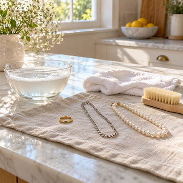
Dust the velvet and microfiber with a soft brush or a soft adhesive roller. Wipe the faux leather with a slightly damp cloth, then let it dry before placing the jewelry back on it.
Avoid abrasive products and hard brushes: they wear out the fibers and leave marks that catch the light.
Store gold safely
Store jewelry in a dry place, away from direct light, and separate each piece to avoid scratches. A soft background protects fine chains, which easily tangle.
A stable display, suitable for the weight of the jewelry, also prevents falls: this is one of the points in the checklist presented above.
12) How to photograph your gold jewelry on a display?
For online sales or social media, the display also serves as a photo backdrop. Gold is a reflective metal: without precaution, it captures everything around it.

Choose a matte and neutral background
A matte and neutral background (gray, cream, beige) makes the color of the gold stand out without unwanted reflections. Neutral and matte displays are the easiest to photograph, as for e-commerce use.
Avoid glossy white and metallic surfaces, which reflect light directly into the lens.
Care for the lighting
Keep the same warm light as for the display, around 3000 to 3500K, with soft and diffused lighting. Aim the source at 30–45° to get soft reflections rather than blown-out highlights.
Take several shots from slightly different angles, then keep the one where the jewelry retains its true shade.
Finally, check the result on a phone screen and on a computer screen: a photo that is too warm makes yellow gold look orange, a photo that is too cool makes it look dull. A few attempts at positioning the display are enough to correct most flaws.
13) Jewelry display for gold: at home or in a store?
The same gold jewelry is not presented the same way at home, in a store, or at a trade show. The right display depends first on what you expect from it: to store quickly, to stage, or to help sell.
| Use | Priority | Recommended supports |
|---|---|---|
| At home | Store quickly, protect | Compartmentalized tray, bust, bracelet support |
| In a store | Attract attention | Busts, ramps, glass dome, bases |
| At a trade show | Transport, set up quickly | Stable, lightweight, easy-to-clean supports |
At home: store and choose quickly
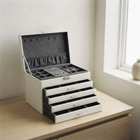
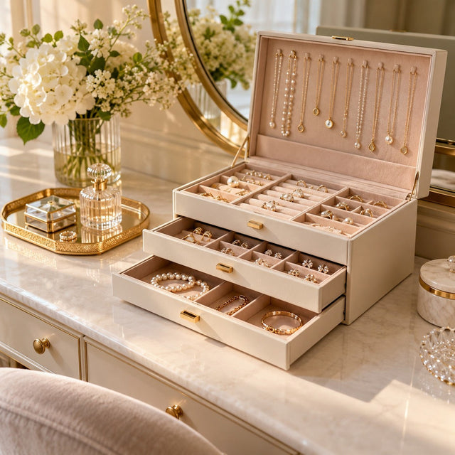
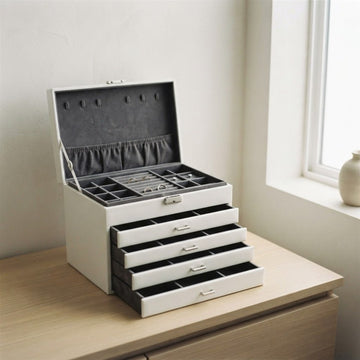
At home, the priority is storage: each piece must be visible, protected, and easy to pick up. A compartmentalized velvet or microfiber tray, a bust for the necklace of the day, and a support for bracelets are often enough.
Choose shades that match your interior, then adapt the background to the shade of gold you wear most: this is the easiest way to keep jewelry that always looks new.
In a store or at a trade show: stage it
In a store, the display must attract attention and highlight the piece: bust, ramp, glass dome, or base. The visual consistency between the supports, the lighting, and the brand image gives an impression of quality at first glance.
At a trade show stand, favor stable supports that are easy to transport and clean, and plan for warm auxiliary lighting if the venue's light is cool.
To give a gold jewelry gift
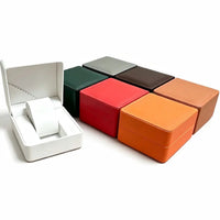
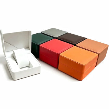
A gold jewelry gift is presented on a cushion or in a velvet box whose color matches the shade of the metal. A cream or beige background enhances yellow gold, a dark background highlights white gold.
Remember to attach a simple support, such as a small bust or a tray, so that the jewelry keeps its place after the gift.
14) Our favorites for displaying gold jewelry
Four models match the advice in this guide: a beige bust for necklaces, a hexagonal tray for rings, a bracelet support, and a gold tray for fine pieces. Find them below, then compare other models in our collections of jewelry busts, ring displays and bracelet displays.


To complete, also read our guides on an elegant jewelry display and how to choose the right jewelry display.
Frequently asked questions about gold jewelry displays
What color display should I choose for yellow gold?
Favor beige, cream, light brown, or taupe gray. These warm tones enhance the shine of yellow gold without dazzling it.
What color display should I choose for white gold?
A dark gray, matte black, or midnight blue background works best: the contrast highlights the metallic purity of white gold.
What color display should I choose for rose gold?
Ivory, light taupe, or sage green balance the warmth of rose and the softness of light.
Velvet or faux leather for gold jewelry?
Velvet and microfiber offer a matte effect and soft light, ideal for rings and bracelets. Faux leather gives a premium look, is easy to maintain, and suits necklace busts well.
What lighting highlights gold?
A warm light of 3000 to 3500K with a color rendering index greater than 90, thanks to spotlights aimed at 30–45° to create soft reflections.
Can yellow gold and white gold be mixed on the same display?
It is better to avoid it: the mixture creates visual confusion. Group pieces by gold shade and adapt the background to each group.
How to avoid unwanted reflections on gold jewelry?
Choose a matte background rather than glossy, aim the spotlights at 30–45°, and avoid shiny metal grids. Diffused light also limits blown-out highlights on the metal.
Is a white background suitable for gold jewelry?
Pure and glossy white accentuates cold reflections and desaturates yellow gold. Prefer a matte, cream, or beige background.
Get our next articles
Tips, guides and new arrivals, straight to your inbox.