
























How to create an elegant and cohesive jewelry display?
The principles of an elegant and cohesive jewelry display
An elegant jewelry display is not a display filled with items. It is a composed display. The difference is enormous: the former tires the eye, while the latter holds it.
The best-selling boutiques—neighborhood jewelry stores, designer concept stores, market stalls, hotel corners—all share the same secret: strict consistency between colors, materials, displays, and lighting. This consistency cannot be improvised.
It is built like setting a table: with a theme, a hierarchy of pieces, and rhythm. Whether you are setting up a permanent display or preparing a one-off event, this guide gives you the complete method for creating an elegant, clear, and effective display designed to turn a curious passerby into a customer.
All without a Place Vendôme jewelry budget—just with the right techniques and the right materials.

Defining a visual theme

Every elegant display answers a simple question asked beforehand: what is this display about? A new collection, a season, an exceptional piece, a theme (wedding, summer, men's jewelry, pearls, colored stones). This theme becomes the visual thread. It guides every choice: palette, displays, accessories, signage.
Without a visual thread, a display accumulates pieces without hierarchy. With a visual thread, every piece seems to belong to the same story. That is exactly the difference between a set and a patchwork.
Three good visual threads to get started: "Golden Summer Pieces", "Solitaires and Wedding Bands", "Natural Stones and Raw Materials". Stick with the theme for 4 to 12 weeks before changing it.
Choosing a limited color palette
Elegance almost always comes from chromatic restraint. A cohesive display never exceeds three dominant colors. Beyond that, the eye becomes distracted. Here are a few proven jewelry palettes:
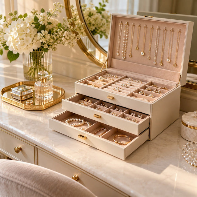
- Cream + rose gold + nude: soft, romantic, perfect for delicate pieces, pearls, and diamonds.
- Pearl gray + silver + midnight blue: sophisticated, timeless, ideal for silver and steel.
- Camel + yellow gold + ivory: warm, desirable, excellent for autumn and gold.
- Pine green + gold + burgundy: luxurious, theatrical, perfect for the holiday season.
- White + marble + rose gold: minimalist, contemporary jewelry, ideal for concept stores.
Once the palette is chosen, it applies to EVERYTHING: displays, backgrounds, accessories, signage, labels. Consistency is what creates elegance.
Selecting two or three dominant materials
Visual consistency also comes down to materials. An elegant display generally combines two to three complementary textures. The principle: each material must have a clear role.
| Material | Effect | Jewelry highlighted |
|---|---|---|
| Velvet | Depth, luxury, absorbs light | Fine jewelry, precious stones |
| Suede | Softness, intimacy, matte finish | Delicate jewelry, gold, pearls |
| Linen | Natural, warm, artisanal | Designer pieces, bohemian pieces, summer |
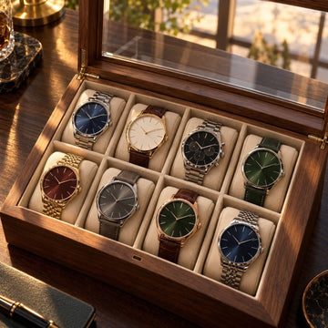
| Wood | Authenticity, masculine, organic | Men's jewelry, watches, raw pieces |
| Marble | Mineral, fresh, contemporary | Contemporary jewelry, graphic pieces |
| Acrylic | Lightness, transparency, modernity | Earrings, rows of pieces |
Avoid mixing burgundy velvet + clear acrylic + raw wood + marble in the same display. It is too much. Choose two main materials (for example, velvet + linen) and one accent material (for example, patinated metal) to structure the composition.
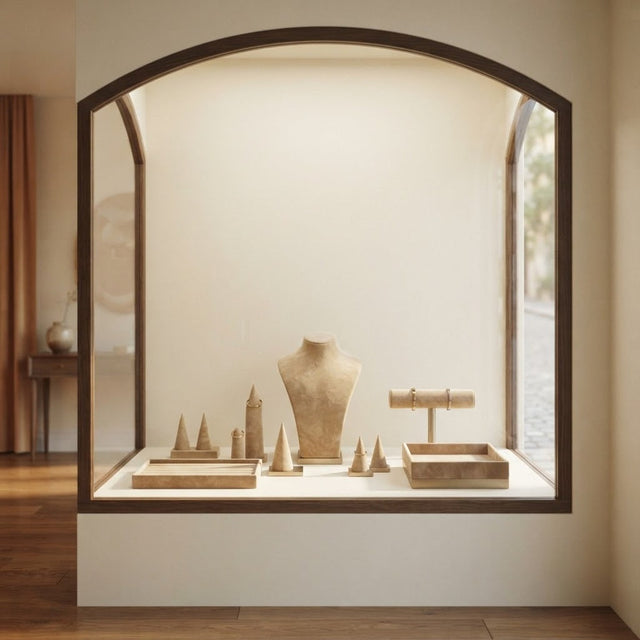
Arranging the display in three planes

An elegant display is read like a painting: there is a foreground, a middle ground, and a background. Each plane has its role.
- Foreground (close to the glass): small pieces with fine details (rings, pairs of earrings), low trays, mini cushions. This is what the passerby sees first as they approach.
- Middle ground: the area for short and medium busts, vertical supports, and medium-sized pieces. This is the level most used by the eye.
- Background: tall bust, high support, discreet signage, branches, or a graphic element. This is what provides depth and identifies the brand from afar.
This three-plane composition creates perspective. Without it, the display remains flat, like an "exhibition of pieces on a shelf." With it, the eye travels from the glass to the back—and the signature piece placed in the middle becomes the center of gravity.
Arrange your display with our displays
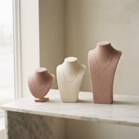
Tall and short busts, thin trays, ring supports: select your displays from a cohesive family to instantly gain elegance.
Discover our displaysThe displays that structure an elegant display
The display is not just a utilitarian object: it is part of the composition. Three criteria for choosing cohesive displays.

1. Identical or complementary color
If you choose sand-colored velvet for the busts, also take a sand-colored tray and cushions, or one in a similar shade (cream, ivory). Avoid mixing sand and burgundy in the same display.
2. Homogeneous material
A velvet necklace bust and a velvet jewelry tray naturally complement each other. A velvet bust and a shiny acrylic tray create a break that may be intentional, but must then be embraced as a strong graphic contrast.
3. Lines that complement each other
Displays must share formal consistency: soft curves throughout, or straight lines throughout. A rounded mini bust next to a very geometric cubic display often creates visual discomfort.
For specific areas of the display, here is what works best:
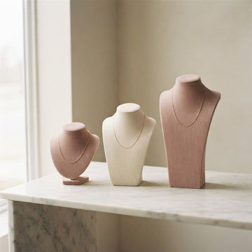
- For necklaces: necklace busts of varying heights in velvet or suede.
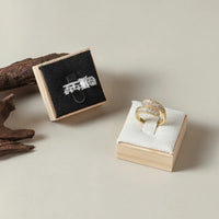
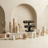
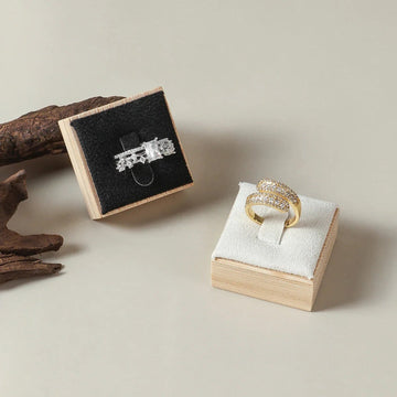
- For rings: multi-level ring displays or cylindrical supports.
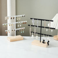
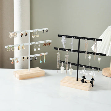
- For earrings: earring displays in acrylic or suede.
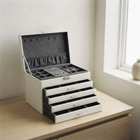
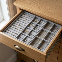
- For overview shots: round or rectangular trays in velvet, linen, or wood.
Our selection for creating an elegant display
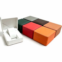
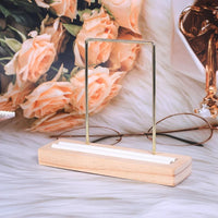
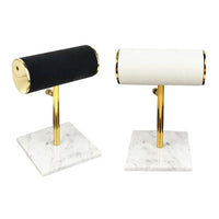
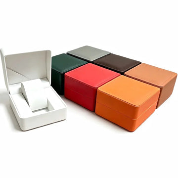
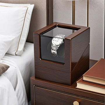
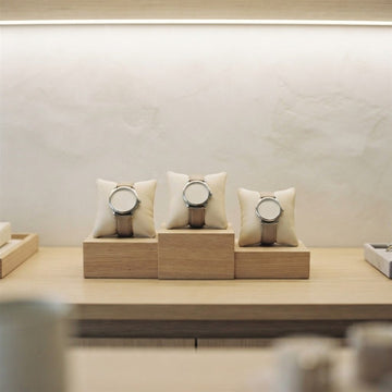
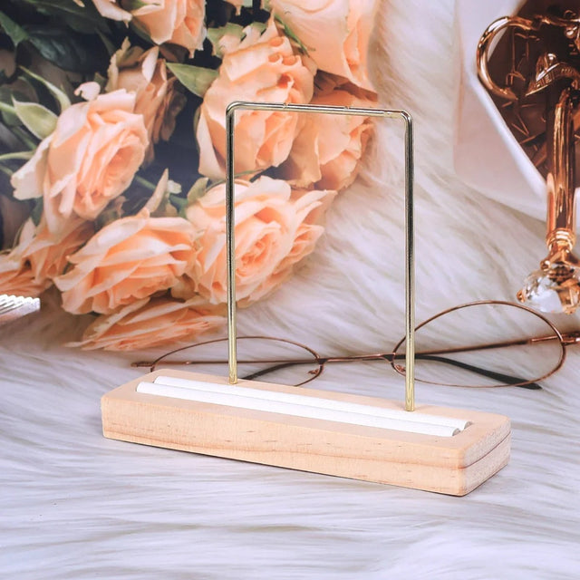
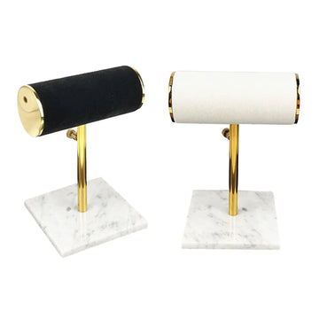
Four displays from neighboring families, to be combined by color and material.


Creating rhythm and breathing space

An elegant display leaves room to breathe. It is paradoxical but essential: showing less allows you to see better. Aim for about 40% empty space in the composition. Breathing areas highlight the pieces and make the display easier to read.
To create rhythm, alternate:
- A dense area (3-4 pieces grouped on a tray)
- Breathing space (empty space or a simple branch)
- An isolated piece highlighted (the signature piece)
- A new dense area
This dense / empty / focal / dense alternation is the signature of luxury displays. It creates a visual journey instead of a wall of jewelry.
Consistency through lighting
Lighting unifies everything. For an elegant display, the rule is simple: a single dominant temperature, and only one or two accents. Mixing 2700 K, 4000 K, and 6000 K in the same display creates a chaotic result that is noticeable even without naming it.
Proven recipe for an elegant display: 2900 K for general ambient lighting + 3500 K for accent lighting on the signature piece. For silver jewelry or light stones, increase to 3500 K for ambient lighting + 4000 K for accent lighting. And always, a CRI (Color Rendering Index) greater than 90.

Three concrete examples of elegant displays

Example 1 — "Minimalist Jewelry" Display
Palette: white marble + rose gold + cream. Materials: marble, ecru linen, a fine touch of rose gold. Three short ivory suede busts, one large marble bust, two thin linen trays with mini cushions. 3000 K lighting + 3800 K accent. Signature piece: a rose gold pendant necklace in the center.
Effect: serenity, contemporaneity, high average ticket.
Example 2 — "Timeless Bohemian" Display
Palette: camel + ivory + honey. Materials: linen, suede, patinated wood. Sand-colored suede busts, linen trays, light wood ring displays, dried eucalyptus branches. 2700 K lighting. Effect: warmth, craftsmanship, strong designer identity.
Example 3 — "Holiday Jewelry" Display
Palette: forest green + gold + burgundy. Materials: deep velvet, gold-tone metal. Forest green velvet trays, burgundy velvet busts, open cases highlighting wedding rings and solitaire rings. 2800 K lighting with 3500 K accents on the stones. Effect: luxury, celebration, maximum perceived value.
Give your shop window a true visual identity
Choose your displays by color family and material: it's the only way to create a cohesive, elegant, and memorable shop window.
View the collectionThe mistakes that break cohesion
- Mixing too many colors: beyond three shades, the shop window becomes cluttered.
- Orphan displays: an isolated bust that doesn't match anything else in the shop window draws negative attention.
- Conspicuous labels: large white labels on a velvet background = visual disruption. Choose discreet, matching labels instead.
- Lack of a centerpiece: without a focal point, the shop window is uniform throughout, and therefore bland.
- Saturation: 50 pieces in a shop window = none stand out.
- Cold lighting: lighting at 5000 K or higher makes jewelry less appealing, especially gold.
How to create a jewelry shop window, step by step
Many retailers wonder how to create a jewelry shop window without spending hours on it. Here is a simple process: it works for a shop window, a glass counter, or a market table.
Empty, clean, measure
Completely empty the space, clean the glass and the background, then measure the available height, width, and depth. These three dimensions determine which displays you can use and how much space to leave for air.
Place the background, then the largest volumes
Start with the background and base trays, then install the tallest supports at the back. The small displays come last, at the front, near the glass. This order prevents you from moving the same pieces ten times.
- Choose the theme and the palette.
- Place the background and base trays.
- Place the tall supports at the back.
- Install the centerpiece at the center of gravity.
- Adjust the lighting, then take three steps back.
Step back, photograph, correct
Take a photo of the shop window from the street or aisle, then look at the image on your phone. An imbalance, a reflection, or an extra object will be immediately visible on the screen. Correct it, then photograph it again.

Counter display, tabletop display, or wall display: which one to choose?
Research into jewelry displays often focuses on the format: counter, table, wall. Each has its strengths, and the three-plane composition adapts to all of them.
| Format | Where to place it | Strength | Point to consider |
|---|---|---|---|
| Counter display | Near the checkout | Pieces viewed up close, easy to offer advice | Limited depth: few planes |
| Tabletop display | Salon, market, shop section | Portable and quick to set up | The background must be created yourself |
| Wall display | Shop wall | Frees up floor space, good visibility | Lighting needs to be planned from top to bottom |
| Column or freestanding display | Center of the space | Can be walked around, viewed from all angles | Takes up floor space |
The counter, for personalized sales
A counter display is viewed up close, often during a conversation with the customer. Focus on fine pieces in the foreground and a single centerpiece, as the depth is limited.
The tabletop display, for flexibility
Placed on a table, it follows your activity: salon, market, shop corner. Plan a background in a color from your palette to recreate the background it lacks.
The wall display, for height
It makes use of height without cluttering the floor. Arrange the pieces by level, with the finest at eye level, and leave space between each row.

An elegant jewelry display at a market or salon
At a stand, everything happens in a few seconds and in a small space. The principles remain the same: a theme, three colors, a rhythm, and a single light source.
A background that creates a frame
A plain tablecloth or a base tray in a color from your palette is enough to structure the table. Avoid patterned fabrics: they draw the eye more than the jewelry.
An independent light source
A salon does not always offer the desired lighting. Bring an auxiliary lamp with a constant temperature, in the warm zone described above, and direct it at the centerpiece.
Set up and pack away quickly
- Photograph your successful display and keep it as a setup model.
- Pack the trays and supports in the reverse order of setup.
- Keep a small kit: soft cloth, replacement pads, matching labels.

Maintaining and updating your jewelry display
An elegant display remains elegant only if it is maintained. Dull glass or a dusty cushion ruins all the composition work.
Every day: glass, background, pieces
- Wipe the glass on both the display side and the customer side.
- Reposition the pieces so they are level and in their place on the supports.
- Check that no light bulbs are dimming.
Every season: change the theme
The theme lasts from 4 to 12 weeks, then it changes. To update without buying everything again, change the trays and cushions, and keep the busts and tall supports.
A simple schedule to follow
| Frequency | Action |
|---|---|
| Every day | Wipe the glass, reposition the pieces |
| Every week | Dust the trays and cushions, check the lighting |
| Every 4 to 12 weeks | Update the theme and the centerpiece |
| Every season | Change trays and cushions if the palette changes |

To go further: The role of colors in jewelry displays, Which display to choose for gold jewelry?, The art of the shop window: how to attract attention before a customer even enters, How to create a luxury atmosphere with your displays?, How to match your displays to your brand identity?, Top 10 most aesthetic jewelry displays for boutiques and How to choose the right jewelry display for your shop window.
FAQ – Elegant jewelry display
What is the maximum number of colors in an elegant display?
Three at most: a dominant color, a secondary color, and an accent color. Beyond that, cohesion is lost and the eye no longer knows where to rest.
Should all displays be identical?
No, but they must belong to the same family (color, material, finish). The same velvet shades, the same wood types, the same metal finishes. A variety of shapes and heights remains essential for rhythm.
How to update a display without buying everything again?
By changing only the trays and cushions. These elements represent less than 20% of the investment but 80% of the visual impression. A few trays in a new shade transform the entire composition.
What size display for a jewelry shop?
An effective display measures at least 80 cm deep to allow for a three-plane composition. Below that, you are forced to lay the pieces flat, which considerably limits elegance.
Should natural elements (flowers, branches) be included?
Yes, sparingly. A single well-placed branch energizes the display. Three floral bouquets turn it into a flower shop. The rule: one plant element per linear meter.
How to check if a display is cohesive?
Photograph it in black and white. If the composition remains readable, balanced, and hierarchical, it is cohesive. If it becomes blurry or chaotic in black and white, it was only color that held it together.
Should you choose a full or minimalist display instead?
A minimalist display highlights the pieces and gives a premium image. A denser display shows the breadth of choice but must then be impeccably organized. The rule: the higher the average ticket, the more minimalist the display should be.
How to light a jewelry display without reflections?
Aim the spotlights at an angle rather than directly at the glass, keep a single light temperature, and choose matte backgrounds. Shiny surfaces reflect the spotlight straight into the eye and create hot spots.
What to put in a jewelry display at a market?
A centerpiece, a few pieces grouped on two or three trays, a plain background, and an auxiliary lamp. It is better to show a few well-presented pieces than the entire collection in a jumble.
Get our next articles
Tips, guides and new arrivals, straight to your inbox.